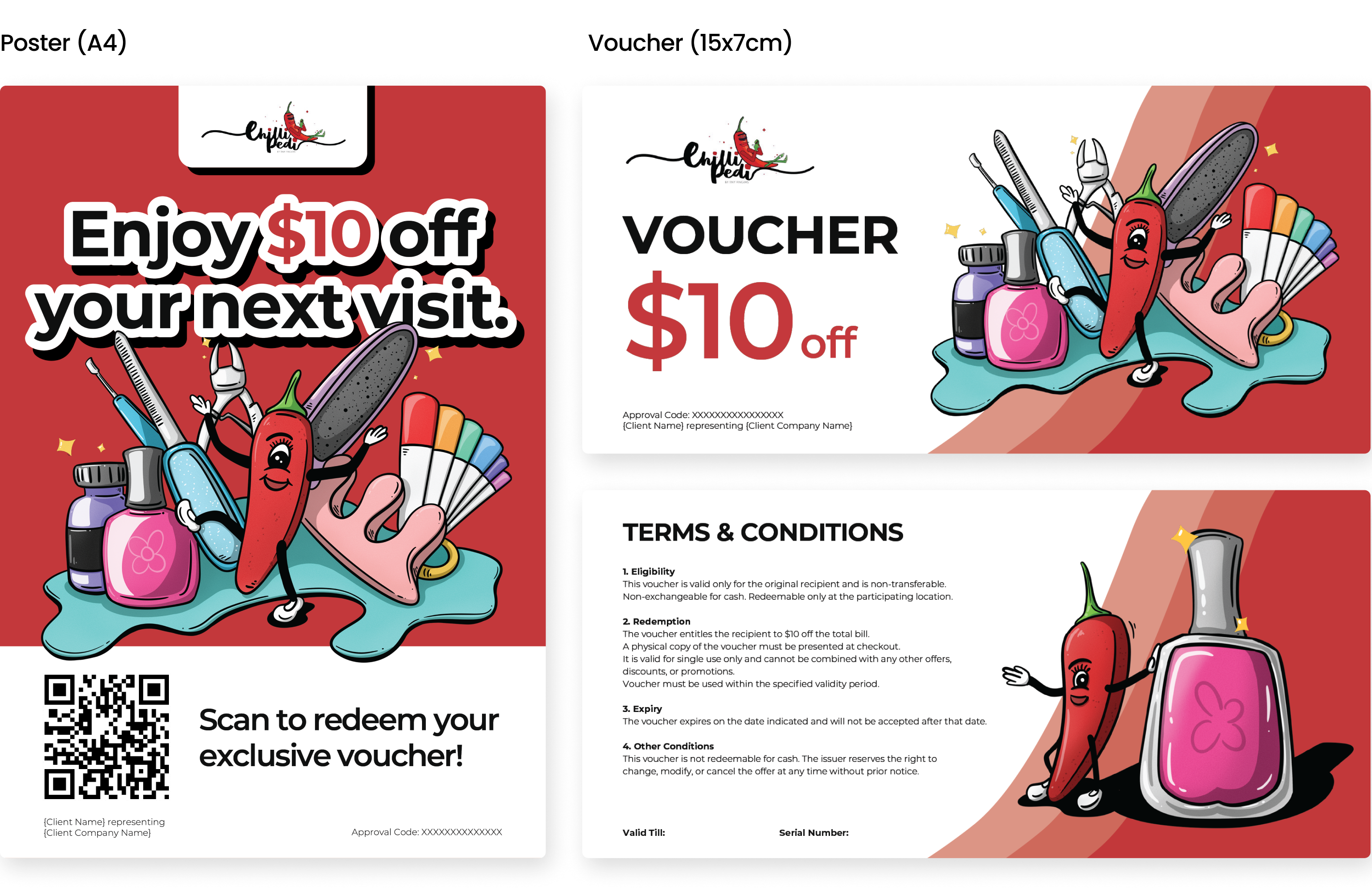
Chilli Pedi - Poster & Voucher Design
I was approached to create a set of print-ready promotional assets with playful illustrations and engaging visual direction. The brief called for something vibrant and mascot-driven, while still retaining a clean, minimal layout.
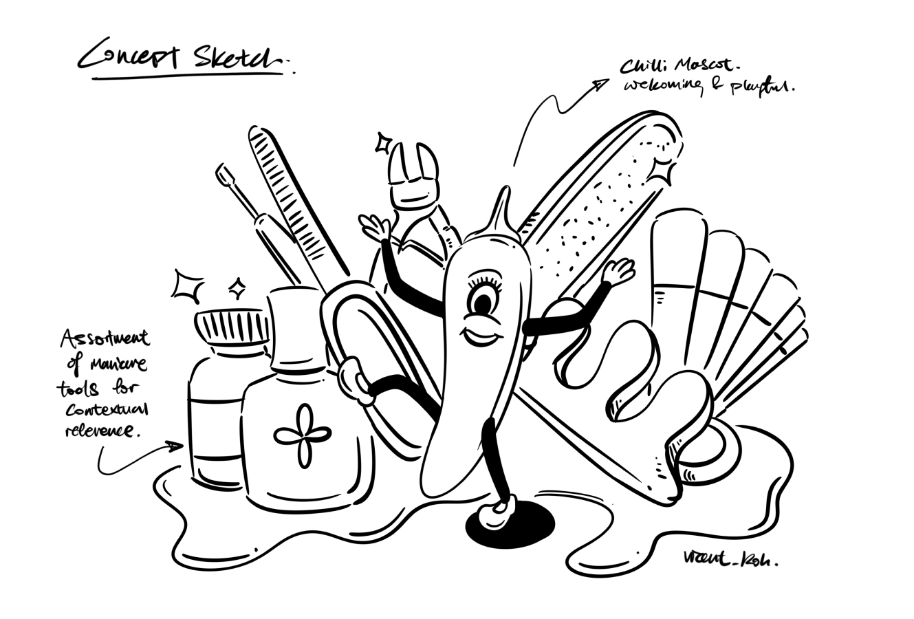
To bring the brand personality to life, I illustrated the key and supporting visuals, placing emphasis on the expressive nature of the mascot along with references to common manicure equipments to support the context of the brand.
All deliverables were prepared as print-ready assets, including proper bleed settings, trim marks, and CMYK color profiles to ensure smooth handoff to the printing vendor.